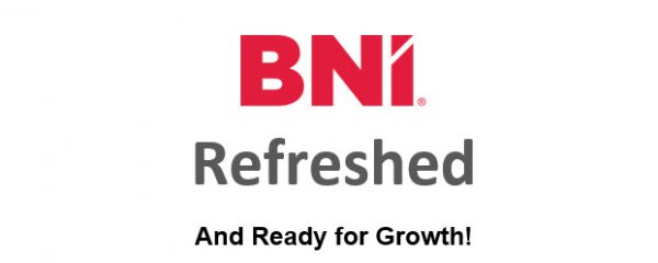
Today we would like to share a short presentation on the BNI Brand Refresh. So get ready for growth.
BNI is the largest and most successful referral networking organisation in the world. It’s a great organisation and it’s a great brand.
One brand that we’re all familiar with is Apple. And like all great brands Apple has evolved. Take a look at the logo on the far left. Believe it or not, that was the Apple logo back in 1976. In case you can’t tell that’s an old looking picture of Sir Isaac Newton sitting under an apple tree. Well just one year later in 1977 Apple refreshed its brand to the iconic rainbow-colored apple design. Important to note is that it didn’t stop there, over the years their brand continued to evolve.
Well as you can see (and we eluded to last week) our great brand has evolved too. In 1985 when Dr. Ivan Misner launched BNI it was simply called The Network. Six years later in 1991, the company was named BNI, Business Network International, and the classic burgundy logo was created.
It’s important to note that the evolution has continued. In March of 2020, in the face of a global health crisis, BNI needed to create an alternative to in-person meetings and as such BNI online was born. In designing the logo it was recognised that it would need to be a transitional logo until the brand refresh took place in May. That’s why the red color was chosen. We knew the new logo was going to be red and that we wanted the transition from one to the other to be smooth.
So now I would like to introduce you to the new BNI logo. Let me tell you a little bit about it. Why we chose red, why did we design it the way we did and what that little white diagonal line means. Well we chose red because red is a power colour. It represents physical energy and symbolises action, confidence and courage. Also, red attracts attention more than any other colour.
We also wanted a design that was professional, yet friendly. The bold custom font provides visual impact in cluttered environments. Each letter’s architectural shape is designed to dominate resulting in a strong, distinct and memorable brand mark.
So why the little diagonal white line, Well the diagonal white line represents the professional and personal growth of the member.
Now that the new design has been launched, you will begin to see it on everything you can imagine. It will appear in videos, social media, at conventions, chapter meetings and more.
We have new social media headers and portraits for Facebook, Instagram, Twitter and LinkedIn. New look website and mobile app.
And when we return to in-person chapter meetings we will start to roll out refreshed new member kits, chapter signage and more.
For each of you we will have new name badges. And of course one of my favorites, the new BNI Online meeting virtual backgrounds. Many can be customised with your information to help promote you and your business.
One thing that’s new for you is the proud member logo. You can use it on your website, business cards, store fronts, social media, services vehicles or any place that you want to promote your association with BNI.
So why is BNI’s brand refresh important to you?
Because we believe this new logo and refreshed design will attract people to the BNI brand to become members. More members means more referrals. BNI has had 35 years of consecutive member growth. With membership growth we have seen our referrals grow significantly. In fact in 2019 globally members had their best year ever with a record 12 million referrals. It only stands to reason that the infusion of new members will bring opportunities for increased business growth.
BNI – We are Growing Forward Together!